Make Data for Testing Statistical Filters
This page discusses the data to be used in subsequent work to develop means of reducing random noise in time series data
The data developed will be described first, followed by explanations on how this set of data came about.
Data Description
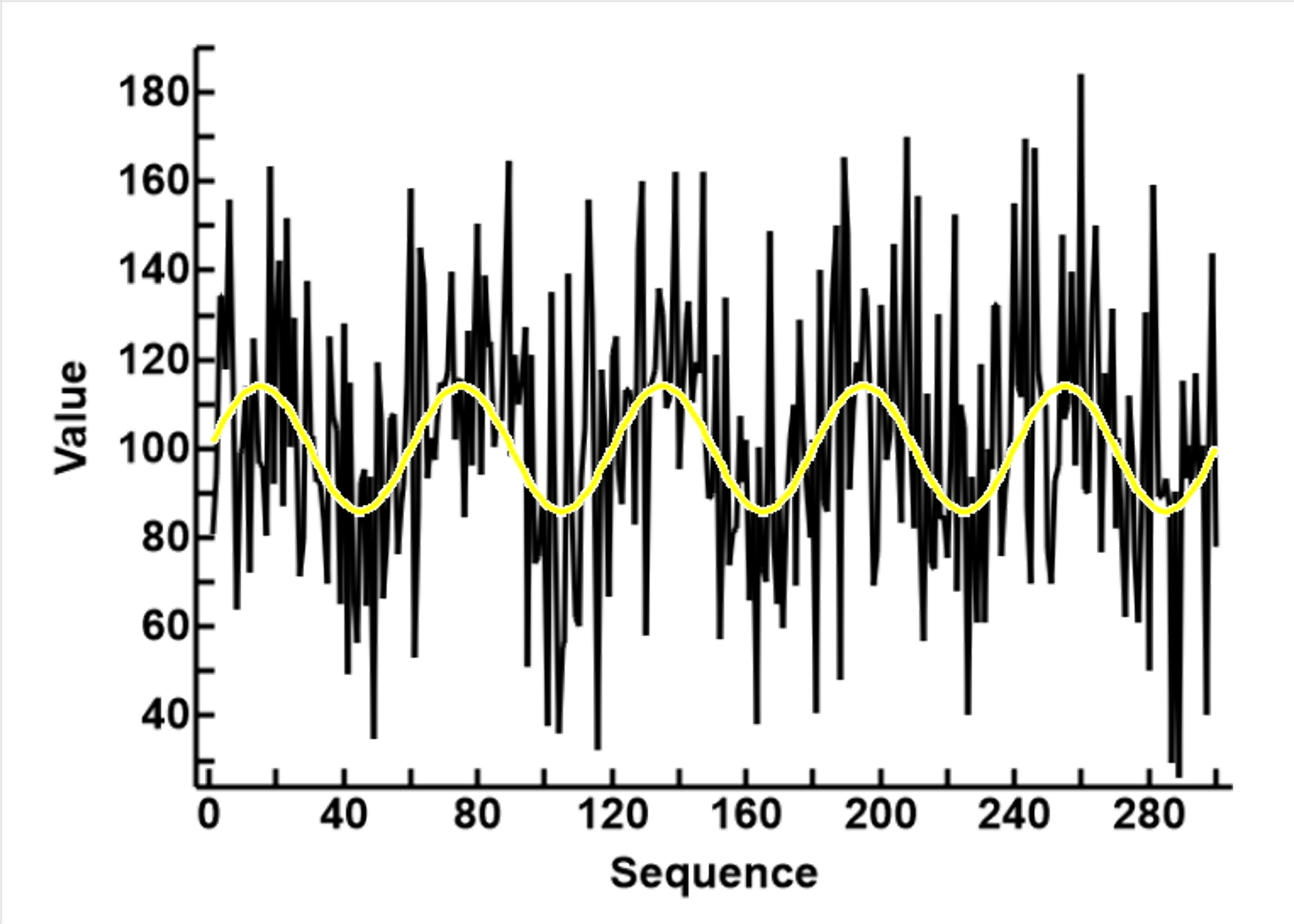
 The data represents a number of noisy sine waves, as shown in the plot to the right. It has 300 rows and 3 columns
The rows
- The rows representing a sequence of values sampled at regular interval from a continuous sine wave.
- There are 300 rows for 5 sine waves. Each wave contains 60 data points at 6 degrees (0 to 360) intervals, 30 for peaks and 30 for troughs
- The value for each row is generated as follows
- The sign value, between -1 and 1 for that degree is obtained
- The value is transformed to a mean of μ=100 and SD σ=10
- The noise is added. The noise is a normally distributed random number, with a mean of 0, and an assigned SD. A coefficient, which is the multiple of the SD of the data set, is used to control the level of noise. The coefficient for the current data is 3. This means that the noise is a normally distributed number, with mean of 0 and SD of 3x10 = 30
The colums
There are 3 columns
- The sequence value, from 1 to 300
- The group designation, false (F) if the data point is from the trough of the sine wave, and true (T) if the data is from the peak of the sine wave.
- The value, the sine values, transformed to a mean of μ=100 and Standard Deviation σ of 10, then with randomly generated noise values added
|
Reasoning and Computer Program
# -*- coding: utf-8 -*-
"""
Make Data.py    To create test data for Simon's project'

2024/01/20
"""

import math
import numpy.random
import statistics

def RandomNormal(mean, sd):
    return numpy.random.normal(mean,sd)


def AddNoise(sourceAr, numSD):
    sd = statistics.stdev(sourceAr)
    noiseLevel = numSD * sd
    print(sd,numSD,noiseLevel)
    resAr = []
    for i in range(len(sourceAr)):
        resAr.append(sourceAr[i] + RandomNormal(0, noiseLevel))
    return resAr


"""
nCycle, number of cycles, each cycle 2 360 degrees, so a pos and a neg wave
nPoints, number of data points for each cycle
toMean and toSD is what sine values 0-1 translate to

The length of the data is nCylcles x nPoints
"""
def MakeSineWaves(nCycles, nPoints, toMean, toSD):
    order = []
    groupNames = []
    groupNumbers = []
    sines = []
    intv = 360 / nPoints
    k = intv
    n = 1
    for i in range(nCycles):
        for j in range(nPoints):
            degree = k % 360
            x = math.sin(math.radians(degree))
            grpName = "F"
            grpNum = 0
            if x>0:
                grpName = "T"
                grpNum = 1
            order.append(n)
            groupNames.append(grpName)
            groupNumbers.append(grpNum)
            sines.append(x)
            k += intv
            n += 1
    mean = statistics.mean(sines)
    sd = statistics.stdev(sines)
    newVals = []
    for v in sines:
        newVals.append(((v - mean) / sd) * toSD + toMean)
    return order, groupNames, groupNumbers, sines, newVals


if __name__ == "__main__":
    nCycles = 5             # number of cycles
    nPoints = 60          # each cycle divided into 60 data points
    toMean = 100          # mean and SD
    toSD = 10

    order, groupNames, groupNumbers, sines, newVals = \
                         MakeSineWaves(nCycles, nPoints, toMean, toSD)

    noise_20 = AddNoise(newVals, 2)
    noise_30 = AddNoise(newVals, 3)
    noise_40 = AddNoise(newVals, 4)
    noise_50 = AddNoise(newVals, 5)

    for i in range (len(order)):
        print(order[i], "\t", groupNames[i], "\t", groupNumbers[i], "\t",  \
              "%.4f" % sines[i], "\t",  "%.4f" % newVals[i], "\t",  \
              "%.4f" % noise_20[i], "\t",  "%.4f" % noise_30[i], "\t", \
              "%.4f" % noise_40[i], "\t",  "%.4f" % noise_50[i])
The Python program that produced the data demonstrated above is shown in the panel to the right. The remainder of this page desceibes the thinking behaind and leading to this program.
It began with idea to explore how to clean up and interpret a sequence of numbers sampled from an analog signal. The model being to sample a continuous electical signal and convert this into digital bipolar values of 0/1
I have in mind two conceptual processes
- To reduce the random variation in order to identify the underlying signal, smoothing the data
- To enhance the difference between the two poles, and eliminate the overlapping values, separating the groups
It is also envisaged that large quantities of data will be repeatedly required for this exercise, firstly to find a suitable set of data to act as the model while exploring alternative strategies. More importantly, if what appears to be a successful strategy emerges, there is a need to repeatedly testing it for robustness (not to make wrong interpretations) and sensitivity (able to detect the underlying signal)
I therefore decided to produce a short program with changeable parameters. As the data is generated by random numbers but controlled by its parameters, similar but different sets of data can thus be generated quickly. The program developed should be able to produce data with the following characteristics
- The underlying pattern to be detected is a sine wave
- The wave can be scaled to vary its amplitude, its width and granularity as number of data points
- It should be able to incorporate generated noise at varying levels
The Python program listed to the right was therefor produced to fulfil these capabilities.
Choosing a Modelling Set of Data
The parameters looked for are as follows
- The data should be easily visualized, and I use a 700x500 pixel panel for display.
- There should be sufficient sine waves to allow variations, to test the flexibility of the algorithm during development
- The granularity (number of data points per wave) should be sufficient to allow meaningful statistical manipulation
- The size of the sample should be such that observable differences can be statistically detected.
- Specifically for the modelling set, the noise level must be large enough to require treatment, but not so large as to require multiple complex manipulation at this early stage.
At this stage, I had no idea of the relative frequency of the waves to detect and the sampling rate, so I had to do some trial and error to see what seems to work.
- I chose a data size of 300 measurement, as experience in clinical statistics informed me that this is a good sample size to do statistics with, and can be clearly displayed on the computer screen
- I chose a granularity of a six degrees change between consecutive data points. This means 60 data points per wave, 30 per peak or trough
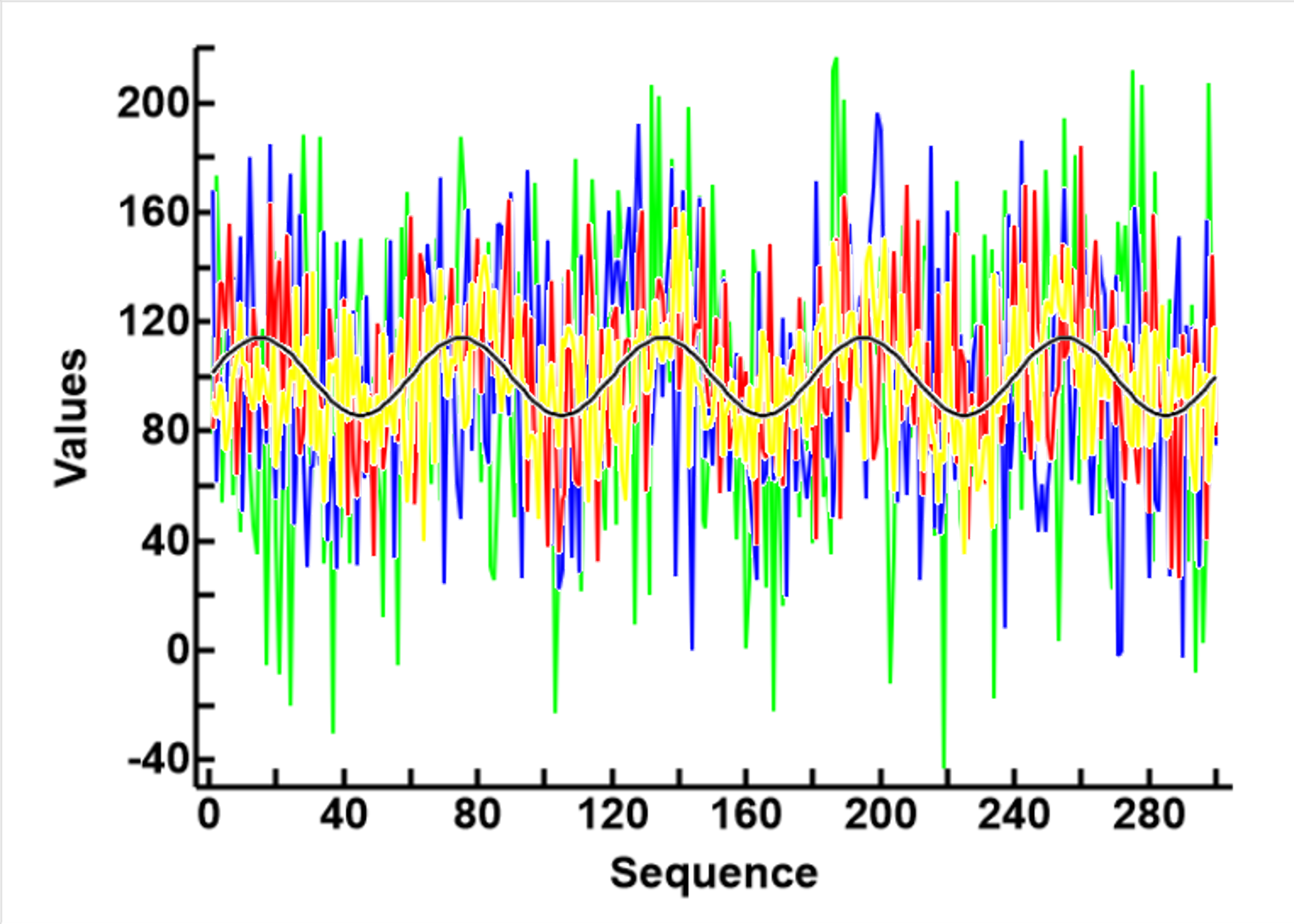
- As shown in the plot to the right, I compared the data where the SDs of the noise are, no noise 0 (black), 2, (yellow), 3 (red), 4(blue), and 5 (green). I decided to use 3SDs (red), as this set of data appears chaotic enough to warrant treatment, but the underlying sinosoidal patterns are still discernable. Sets 4 (blue) and 5 (green) can be used later to test the limitations of any algorithm that appears to work.
Description of the Modelling Data
| F | T | All |
| n | 150 | 150 | 300 |
| Set_0 | |
| mean | 91.0201 | 108.9799 | 100 |
| SD | 4.3767 | 4.3767 | 10 |
| Set_3 | |
| mean | 92.0824 | 112.5713 | 102.3268 |
| SD | 28.9289 | 26.8896 | 29.7096 |
The data containing the sine wave and without noise is named Set_0, and the modelling data, with the SD of noise 3 time the SD of the noiseless data, is named Set_3. The sequence of values in the two sets, yellow for Set_0 and black for Set_3, are shown in the first of the plots to the left, and the basic statistical description of the data shown in the table. The plot shows that the incorporation of noise increases the variability of the signal, so the range of the values have increased
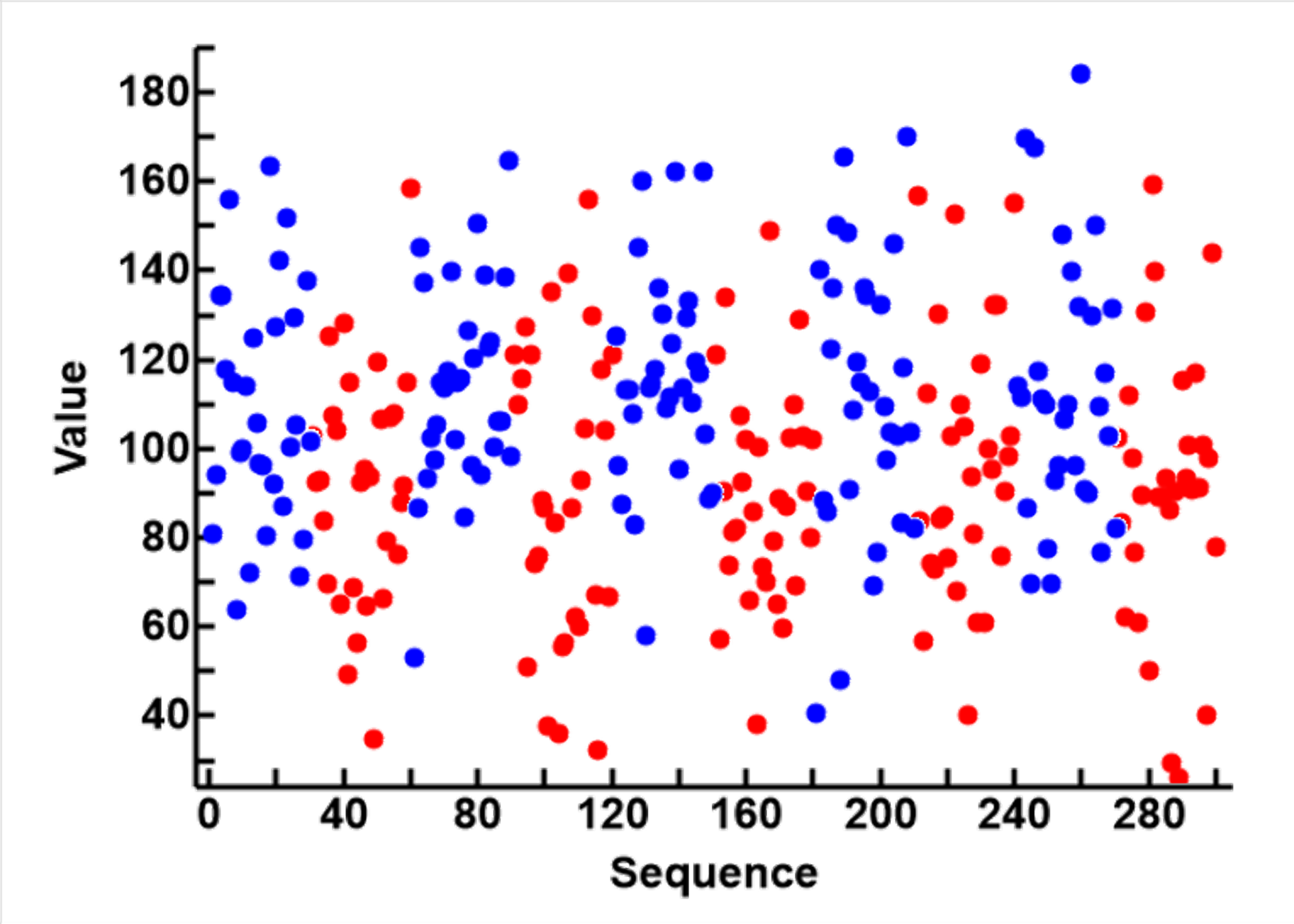
Only the data of set_3 are shown in the second plot to the left. The blue circles are from those values that were above the midline (v=100) of the noiseless sine wave, and are designated group true (T). The red circles are those values at or below the midline of the original sine wave, and are designated as group false (F). This plot shows how the incorporation of noise increases the overlapping of the data in the two groups
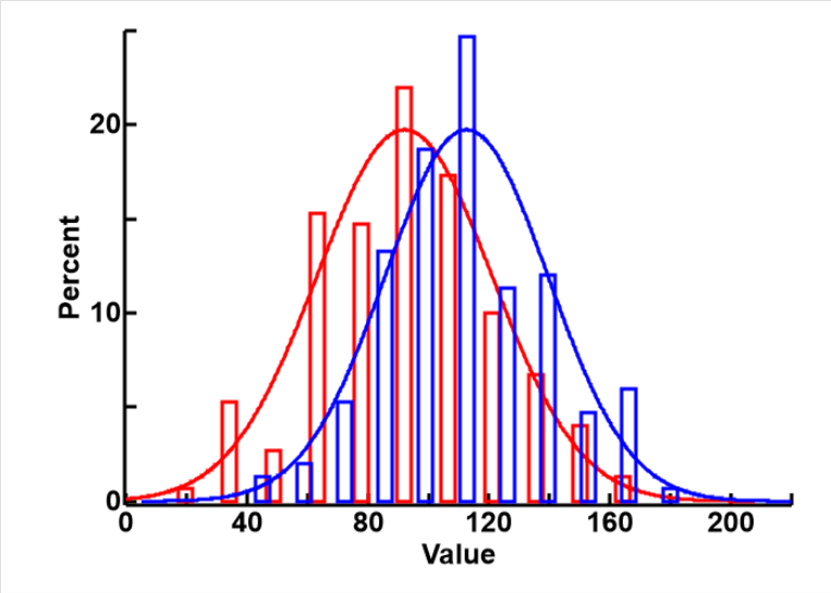 The difference betwwen the F (red) and T (blue) groups is also shown in the normal distribution plot to the right. It can be seen that the spread of the data in the two groups are similar, the modes are different, but there are large overlaps because of the high noise level.
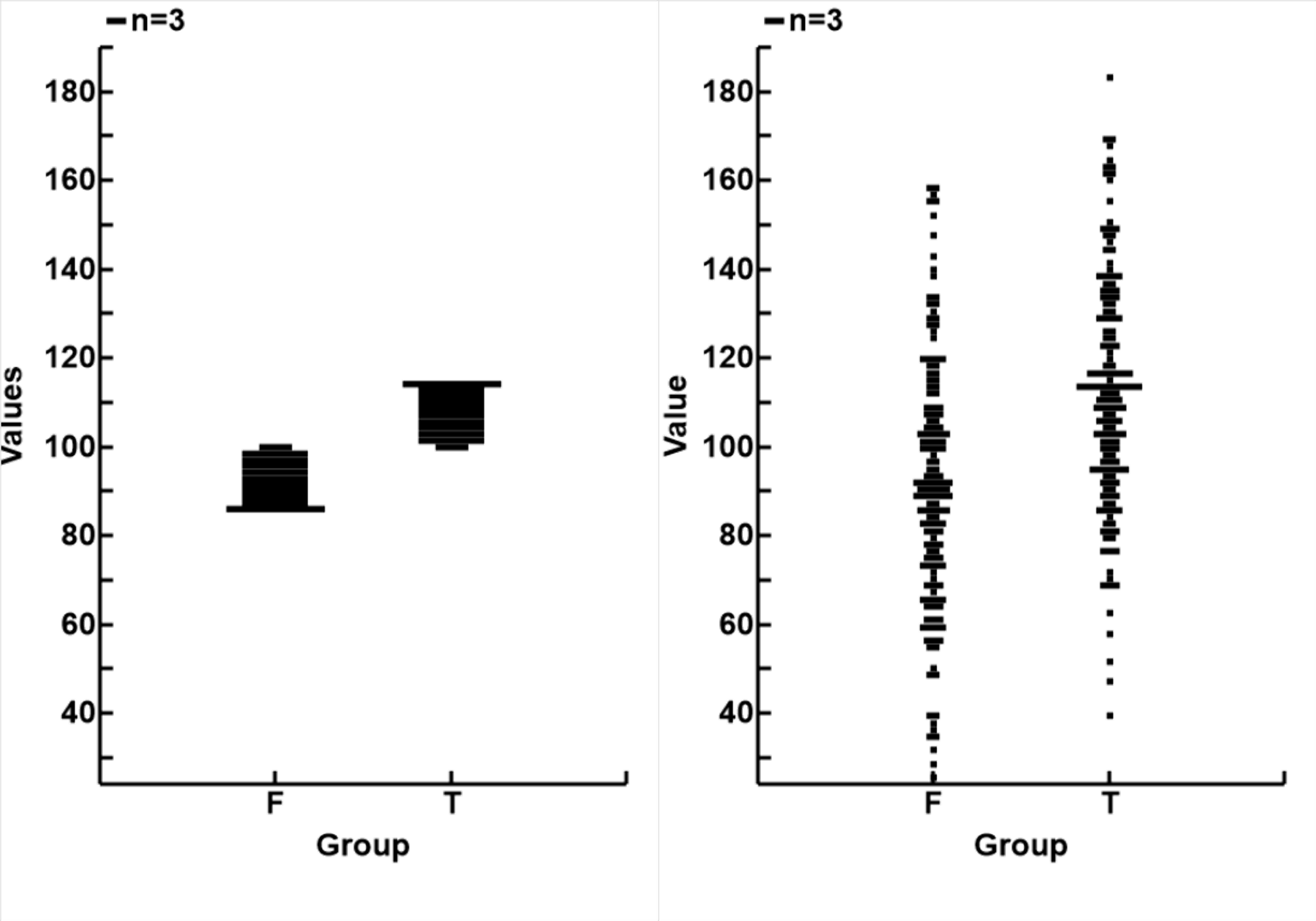
The distributions of data from the two groups (F and T) in the two sets (Set_0 to the left and Set_3 to the right) are fusther demonstated in the plot below and to the left, and in the table above.
It can be seen that the sign wave data has uniform distribution, and the two groups are defined by their values, so there is no overlap.
With the addition of noise, and particularly if the noise is random but normally distributed, the range of measurements is much increased, and the data in the 2 groups now are more normally distributed, and overlap considerably.
 Thinking backwards, the real signal inside the noise is likely to be of smaller amplitude then the raw signals, which included the noise, and the difference betwwn the two poles is very much smaller than what appears in the signal.
Comments
I suspect that the limiting factors in translating analog signals to bipolar values are
- The signal/noise ratio, exemplified by the difference in the SDs of Set_3 and Set_0. It is 3 in this set
- The granularity, exemplified by the number of data points available for each wave. It is 30 for each half wave (a peak or a trough) in this set
As I have no information on what these parameters might be in a set of real data, the modelling set (Set_3) is meant only for initial development, until better parameters or data produced by machinery or electronics are available.
I shall therefore proceed with what I have got (Set_3), and would be grateful for comments and suggestions for change from you